Designing educational websites for kids and parents is a challenge that should balance fun and learning. Your main objective should be to engage young users while providing valuable information for their parents. But how does one achieve this?
This article addresses these pain points and provides all the insights and strategies to design a website that meets the needs of both audiences.
Wondering how to strike that perfect balance? Keep on reading to find out!
Creating Educational Websites for Kids and Parents: Challenges and Opportunities
Balancing Two Audiences: Kids vs. Parents
Good family-friendly learning sites must find a perfect balance between the needs of children and parents. Children look for bright colors, playful features, and games that make learning fun. Parents–on the other hand–care for the educational value, safety, and usability to make sure their kids benefit from the content.
This balance keeps children engaged and the parents feel at peace. Additionally, it contributes to the website’s success and effectiveness as an educational tool.
Usability and Engagement
These two things go hand in hand when designing kid-friendly educational websites. Imagine a site that’s super easy to navigate—kids can jump from one fun game to another with no problem, and parents can quickly find the necessary info. If the site’s a breeze to use, everyone stays engaged and happy. This means more time spent learning and playing, and less time getting frustrated. A classic win-win situation!
Safety and Privacy Concerns
All parents prioritize safety and privacy when it comes to their children’s online activities. They want to make sure that the interactive learning site for kids is safe and trustworthy before allowing them to use it. Here are some ways to achieve this:
- Create a dedicated page explaining the website’s purpose and privacy policies
- Clearly state what information will be collected from users and how it will be used
- Implement robust security measures like encrypted data transmission and strong password protection
- Offer parental controls and settings that are easy to navigate.
Opportunities for Interactive Learning and Parental Involvement

Who says learning can’t be fun? Gamification, interactive elements, and playful typography are game-changers (pun intended). Kids love the excitement!
Just check out how Nobel Courses, PBS Kids’ Design Squad, and Cyberchase nail it with their creative designs. By making lessons feel like play, you keep kids hooked.
This mix of fun and education boosts learning and turns each visit into an adventure they can’t wait to come back on again and again.
Colors and Typography
Use Bright Colors
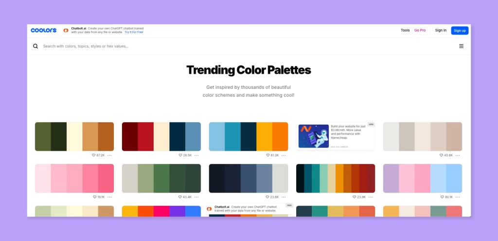
When designing educational websites for kids, don’t shy away from using bright colors. They aren’t just for making things look pretty—they play a huge role in keeping young users engaged.
Think of vibrant hues as a tool to capture their attention and curiosity. Kids are naturally drawn to playful and lively environments, and your color choices should reflect that.
Bright colors also help differentiate sections and elements, making the site easier to navigate. Embrace the bold and the brilliant; it’s all about making learning fun and intuitive for the little ones.
Typography That Is Playful and Clear
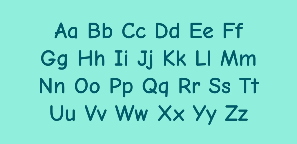
You want fonts that are fun and playful, but also easy to read. Think about using rounded, bubbly typography. Avoid overly decorative fonts that can be hard to decipher.
Larger font sizes can help too—kids shouldn’t have to strain their eyes to read. And don’t forget about spacing; ample line spacing and clear distinctions between headings and body text make a big difference. The goal is to create a reading experience that’s both enjoyable and effortless for young learners.
Break the Traditional Structure
Don’t be afraid to bend the rules for the sake of creativity and engagement. Kids respond well to layouts that are dynamic and fun. Experimenting is key.
Try using unconventional grid systems, asymmetrical layouts, and other surprising elements that capture attention. You can also implement interactive features like animations and videos.
Remember that your primary goal is to make the educational experience fun, not just to follow design norms.
Imagery and Interactive Elements
Here are some essential tips to achieve this balance when it comes to visual elements:
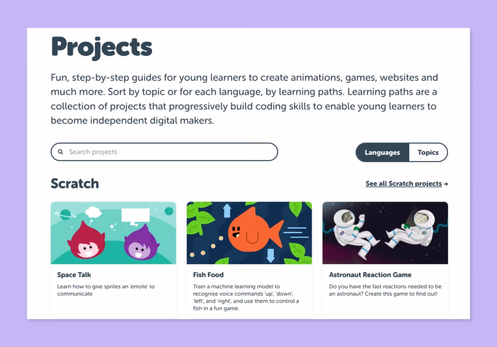
1. Use educational and fun kid-friendly imagery → Select vibrant, high-quality images that are visually appealing and have an educational purpose. Use pictures of animals, plants, and scientific tools to spark curiosity and interest. This approach not only captures kids’ attention but also reinforces the educational themes you aim to convey.
2. Implement interactive features → Elements like quizzes, puzzles, and drag-and-drop activities can engage children even more and reinforce learning through play.
3. Use Informative visuals & infographics → Use visuals to break down information into digestible chunks, helping both kids and parents understand the content quickly.
4. Use animation and sound → Add animations and sound effects to make the content more dynamic. Use these elements to amplify the educational content, not to overwhelm or distract the kids from the main message.
5. Gamification → Introduce game-like elements such as points, badges, and goals. This motivates children to engage with the content more frequently, making learning fun and rewarding.
6. Incorporate videos → Use short, informative videos to explain concepts. Videos can capture children’s attention effectively and are a great way to present information in a memorable way.
7. Inform the parents → Incorporate sections or pop-ups that provide parents with insights into their child’s learning progress and suggestions for at-home activities. Additionally, consider sending regular emails or messages with updates on their child’s achievements and areas for improvement. This approach guarantees that parents remain informed, engaged, and able to support their child’s educational journey effectively.
Bottom Line
Designing educational websites for kids and parents is not a one-way street. You are allowed to bend the rules a bit, as long as you keep it engaging and informative.
Imagine it like a board game and bring out your inner child. Use bright colors, playful typography, and interactive elements to captivate children, while ensuring usability and safety to reassure parents.
This dual approach keeps kids entertained and parents informed. After all, who wouldn’t prefer having fun while learning?
FAQs
How to design a website for kids?
Designing a website for kids involves creating an engaging, user-friendly, and safe environment. Use bright colors, playful typography, and interactive elements. You can also add easy navigation with large buttons and clear icons. Safety is important so strong privacy measures and parental controls are key.
What are the features of a good website for kids?
Engaging content, a safe environment, user-friendly design, bright and colorful visuals, and age-appropriate content. It should also have clear navigation, fun games, puzzles, quizzes, and robust security features to protect children’s data.
How can color and typography be used to appeal to both audiences?
Use bright, bold colors to attract children and create a lively atmosphere. Incorporate playful yet clear fonts to maintain readability for both kids and parents. Balance the design with vibrant colors for kids’ sections and subdued tones for informational sections for parents.
How do you balance fun and educational content on a website?
One word: gamification. You can make learning engaging and fun by integrating game-like elements such as points, badges, and rewards.